
One of the featured online articles at Newsweek has renowned cover artist Chip Kidd picking his favorite book jacket designs(and he gets bonus points for making Twilight number five on his list there)and while his choices are visually interesting, they also provide some food for thought.
While the old saying of "never judge a book by it's cover" is meant to apply to both people and text,we nevertheless tend to do the complete opposite of that in life. For the purposes of this discussion,I'd like to look at some of the book covers that have such a strong impact on me over the years and see what,if anything,they say about me and my literary tastes.

This edition of Little Women is part of the Illustrated Junior Library series put out by Grosset & Dunlap and it was given to me as a Christmas present from one of my aunts on my mother's side. While I do have a couple of other copies of this book,this one feels to me like the most authentic one.

The cover illustration goes all the way around the book,giving it a sense of fullness and embracing the warmth and charm of the March family along with it. It also showcases the female focus of the plot nicely without appearing to be too sweetly homespun. Whenever I think of the March sisters,these are the faces that I see in my mind's eye.

I clearly remember seeing Richard Adam's Maia in a wire paperback rack display at a department store(which no longer exists)and wanting it instantly. My copy had the burgundy background rather than the black,another major selling point for me. Reds and purples tend to entice me quite a bit.
The intricate details of the illustration have such a richness to them,with the added bonus of the embossing done to the lettering and certain features of the picture.
Running your fingertip over the title,the flowers in Maia's hair and the vine that is casually draped around her head is one of those savory delights that mass market paperbacks don't seem to offer much these days. Sort of the equivalent of smelling the cork of the wine bottle before pouring yourself a glass.

During my Jane Austen group trip thru England back in '02,there were a number of books that I was actively in search of but Atonement was not one of them. The book was still in hardcover in the U.S. and while it received a slew of great reviews, I had no interest in reading it whatsoever.
Picking up a copy at the airport as a last minute purchase,I think that the cover for the British paperback was the deciding factor. The little girl sitting forlornly on the steps made the book seem more accessible. The American hardcover had a photo of a manor house with the focal point being a fountain on the lawn,making the story seem cold and remote.
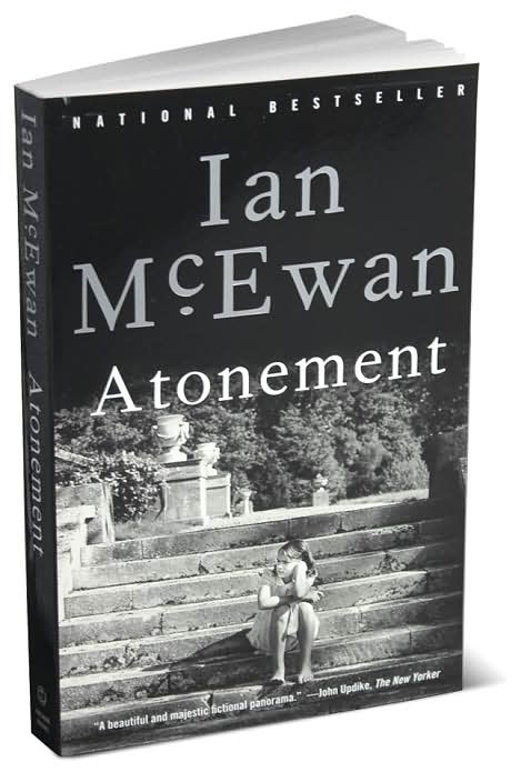
While the U.S. paperback did have the little girl on the steps,she was shown in a long shot that threw more focus on the landing where she was sitting and I absolutely hated that pitch black background(plus the b&w tint of the photo) that was chosen for it;why not just scream "THIS IS A SERIOUS NOVEL!!!" there,honestly!
The Brit softbound had the right idea of using warm yet subtle tones to draw you in and make you wonder what is on the mind of that young girl sulking in the sunlight. Fortunately,the novel delivered on that engaging promise tenfold.

Another unexpected buy on that trip was Joanne Harris' Coastliners;the compact size of the hardcover plus the rustic look of the objects lined up against the well worn fence-particularly the blue shoe with the starfish inside-made it a must-have.
Granted,I was already a fan of her work due to Chocolat and Blackberry Wine but the unique design of this book(to my eyes,anyway)was like choosing between a standard DVD edition of a movie or the special collection edition.
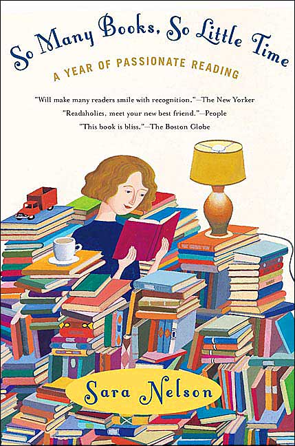
Advance Reader copies of books sometimes have cover art that is changed before it becomes officially on sale at a bookstore near you. Fortunately,this delightful illustration that appears on So Many Books,So Little Time:A Year of Passionate Reading survived the vetting process. I still have the review copy and even had a promotional poster for this book displayed in my home for awhile.
I wasn't familiar with Sara Nelson before this chronicle of her reading habits came out and the cover art was a good incentive for me to give it a try. Part of the reason that it appeals to me is that it's sort of how my bedroom is at home(except for the toy truck-I have plenty of other pop culture knickknacks instead).
Well,these are just a few of the covers that have enchanted me over the years,but it's pretty obvious that I'm drawn to female friendly images. A challenging thing for my fellow readers out there to do over the upcoming holiday weekend is to look over their personal library and see if some of the book covers on their shelves reflect on their inner beings as well. Thinking about why you read is just as important as reading itself:
2 comments:
Great topic, one I've often thought and sometimes blogged about. Reactions are so personal, and often contradictory from reader to reader. I think the covers of the 'Twilight' books, for example, area all absolutely gorgeous, but I don't like the story (at least, the first, since that was the only one I read). Covers seem to have a stronger influence on me than a lot of other readers.
A recent favorite: 'I Loved, I Lost, I Made Spaghetti' perfectly captured content.
I've seen that cover,M,and totally agree-I love the spaghetti heart loop,a nice touch:)
Post a Comment